【前端】20种前端Button样式设计,提升用户体验的秘密武器!

💥 欢迎来到[爱学习的小羊]的博客!希望你能在这里发现有趣的内容和丰富的知识。同时,期待你分享自己的观点和见解,让我们一起开启精彩的交流旅程!🌟>

-
首页:爱学习的小羊 – 热爱AI、热爱Python的天选打工人,活到老学到老!!!
-
导航
- 常用开发工具:包含 代码补全工具, Vscode-AI工具, IDER or Pycharm-AI工具, 获取OpenAIAPIKey的多种方式等更多教程…
- VScode-AI插件:集成13个种AI模型(GPT4、o1等)、支持Open API调用、自定义助手、文件上传等 >>> - CodeMoss & ChatGPT-AI中文版
-
💥 期待与你一起学习前端知识、共同成长🌟
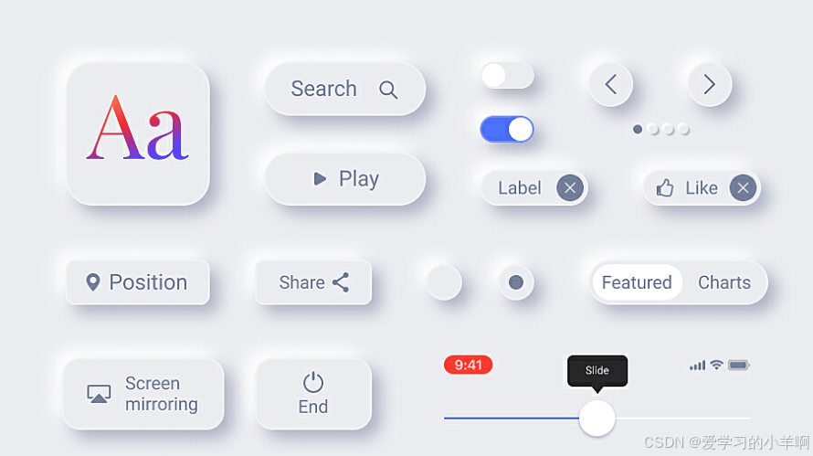
在现代网页设计中,按钮不仅仅是一个简单的交互元素,它们是用户与网站之间的桥梁。一个设计精美、功能强大的按钮可以极大地提升用户体验,增加用户的参与度和满意度。那么,如何设计出既美观又实用的按钮呢?今天,我将为大家分享20种常见的Button样式,帮助你在前端开发中提升用户交互体验!🚀
1. 默认样式
最基础的按钮样式,适合大多数场景。
.button {
  background-color: #007bff;
  color: #fff;
  border: 1px solid #007bff;
}
2. 扁平样式
去掉阴影和边框,给人一种简约的感觉。
.button {
  background-color: transparent;
  color: #007bff;
  border: none;
}
3. 圆角样式
通过设置边框半径,按钮看起来更加柔和。
.button {
  border-radius: 5px;
}
4. 阴影样式
增加阴影效果,让按钮看起来更有层次感。
.button {
  box-shadow: 0 2px 4px rgba(0,0,0,0.1);
}
5. 渐变样式
使用渐变背景,给按钮增添视觉冲击力。
.button {
  background: linear-gradient(to right, #ff4e50, #f9d423);
  color: #fff;
}
6. 边框样式
透明背景与边框相结合,形成鲜明对比。
.button {
  border: 1px solid #007bff;
  background-color: transparent;
  color: #007bff;
}
7. 透明样式
强调透明背景,适合与复杂背景搭配。
.button {
  background-color: transparent;
}
8. 图标样式
在按钮中加入图标,增强视觉效果。
.button {
  padding-left: 20px;
  background: url('icon.png') left center no-repeat;
}
9. 悬浮样式
鼠标悬停时改变背景色,提升交互感。
.button:hover {
  background-color: #0056b3;
}
10. 点击样式
点击时按钮稍微下沉,模拟真实的物理反馈。
.button:active {
  transform: translateY(1px);
}
11. 圆形样式
将按钮设计为圆形,适合社交媒体图标等。
.button {
  border-radius: 50%;
}
12. 边框渐变样式
结合渐变边框和背景,形成独特的视觉效果。
.button {
  border: 1px solid transparent;
  background: linear-gradient(to right, #ff4e50, #f9d423);
  color: #fff;
}
13. 悬浮渐变样式
鼠标悬停时改变背景为渐变色,增加动感。
.button:hover {
  background: linear-gradient(to right, #ff4e50, #f9d423);
  color: #fff;
}
14. 三维样式
通过增强阴影效果,模拟立体感。
.button {
  box-shadow: 0 4px 8px rgba(0,0,0,0.3);
}
15. 反向样式
鼠标悬停时反转颜色,形成鲜明对比。
.button {
  background-color: #007bff;
  color: #fff;
}
.button:hover {
  background-color: transparent;
  color: #007bff;
}
16. 边框圆角样式
结合圆角和边框,形成柔和的视觉效果。
.button {
  border-radius: 20px;
  border: 1px solid #007bff;
}
17. 悬浮阴影样式
鼠标悬停时增加阴影,提升按钮的立体感。
.button:hover {
  box-shadow: 0 4px 8px rgba(0,0,0,0.3);
}
18. 打字机样式
结合动画实现打字机效果,吸引用户注意。
@keyframes typing {
  from { width: 0; }
  to { width: 100%; }
}
.button {
  overflow: hidden;
  white-space: nowrap;
  animation: typing 2s steps(30, end);
}
19. 灯泡样式
在按钮中加入灯泡图标,适合科技类网站。
.button {
  background: url('lightbulb.png') center center no-repeat;
}
20. 鼓起样式
点击时按钮放大,模拟鼓起效果。
.button {
  transform: scale(1);
  transition: transform 0.2s;
}
.button:active {
  transform: scale(1.1);
}
复杂的Button样式
除了以上20种基本样式,我们还可以通过结合多种CSS属性和技术,设计出更复杂的按钮样式。以下是一些示例:
1. 渐变边框+阴影+动画按钮
结合线性渐变背景、边框渐变、内外阴影以及悬停动画效果。
.complex-btn {
  display: inline-block;
  padding: 10px 20px;
  font-size: 16px;
  color: #fff;
  border: 2px solid transparent;
  border-image: linear-gradient(to right, #ff4e50, #f9d423) 1;
  background: linear-gradient(to right, #ff4e50, #f9d423);
  border-radius: 5px;
  box-shadow: 0 4px 8px rgba(0,0,0,0.1);
  transition: all 0.3s ease;
}
.complex-btn:hover {
  background: linear-gradient(to left, #ff4e50, #f9d423);
  box-shadow: 0 6px 12px rgba(0,0,0,0.2);
  transform: translateY(-2px);
}
.complex-btn:active {
  transform: translateY(0);
  box-shadow: 0 2px 4px rgba(0,0,0,0.1);
}
2. 立体效果按钮
通过多重阴影和边框来模拟按钮的立体效果。
.stereo-btn {
  display: inline-block;
  padding: 10px 20px;
  font-size: 16px;
  color: #fff;
  background: #3498db;
  border: none;
  border-radius: 5px;
  box-shadow:
    0 5px #999,
    0 10px 15px rgba(0,0,0,0.4);
  position: relative;
}
.stereo-btn:before {
  content: '';
  position: absolute;
  top: 0;
  left: 0;
  width: 100%;
  height: 100%;
  background: #3498db;
  border-radius: 5px;
  z-index: -1;
  box-shadow:
    0 15px 25px rgba(0,0,0,0.6),
    inset 0 -3px rgba(0,0,0,0.2);
}
.stereo-btn:hover {
  cursor: pointer;
  background: #2980b9;
}
.stereo-btn:hover:before {
  background: #2980b9;
}
3. 波纹效果按钮
利用伪元素和动画实现点击时的波纹扩散效果。
.ripple-btn {
  display: inline-block;
  padding: 10px 20px;
  font-size: 16px;
  color: #fff;
  background: #4CAF50;
  border: none;
  border-radius: 5px;
  overflow: hidden;
  position: relative;
  transition: background-color 0.3s;
}
.ripple-btn:before {
  content: '';
  position: absolute;
  top: 50%;
  left: 50%;
  transform: translate(-50%, -50%);
  width: 0;
  height: 0;
  border-radius: 50%;
  background: rgba(255, 255, 255, 0.3);
  animation: rippleEffect 0.6s ease-out;
  z-index: -1;
}
@keyframes rippleEffect {
  from {
    width: 0;
    height: 0;
    opacity: 1;
  }
  to {
    width: 200px;
    height: 200px;
    opacity: 0;
  }
}
总结
设计按钮不仅仅是为了美观,更是为了提升用户体验。通过合理运用CSS样式,我们可以创造出既美观又实用的按钮,吸引用户的注意力,提升网站的交互性。希望这些Button样式能够为你的前端开发提供灵感,让你的项目更加出色!💡
相关文章
【OpenAI】(一)获取OpenAI API Key的多种方式全攻略:从入门到精通,再到详解教程!!
【VScode】(二)VSCode中的智能AI-GPT编程利器,全面揭秘CodeMoss & ChatGPT中文版
【CodeMoss】(三)集成13种AI大模型(GPT4、o1等)、支持Open API调用、自定义助手、文件上传等强大功能,助您提升工作效率! >>> - CodeMoss & ChatGPT-AI中文版